Custom Floral Watercolor Crest Defines Devon + Greg’s Wedding

Devon Sanford’s wedding at the Hilton Renaissance was designed with intention, artistry, and a clear visual identity that carried throughout every detail. From the very first paper piece to the final moments of the evening, the celebration unfolded with a sense of cohesion rooted in thoughtful design.

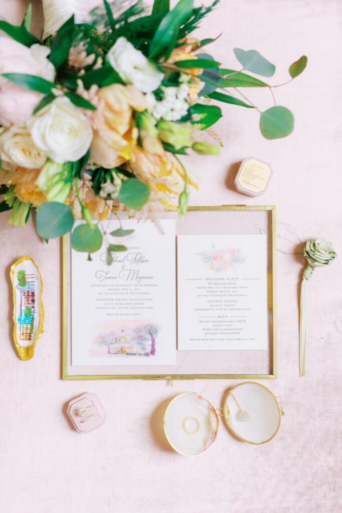
At the heart of the wedding was a custom floral watercolor crest, created as the signature element of the celebration. Softly painted florals framed the crest with organic elegance, balancing romance with refinement. This artwork became the visual thread that tied the entire day together, offering guests a consistent and meaningful design experience from start to finish.

The crest made its debut on the save the dates and invitation suite, setting expectations for a celebration that felt polished and personal. From there, it carried seamlessly into the wedding day details. Menus, place cards, table signs, and a mirror seating chart all echoed the same artwork and typography, creating a layered and cohesive aesthetic that guided guests through the evening with ease.

One of the most striking design moments came when the crest was transformed into a floor gobo. Illuminated across the space, the artwork moved beyond paper and became part of the atmosphere itself. This unexpected application reinforced the importance of a strong design foundation, showing how a single element can live across multiple mediums while still feeling intentional and refined.

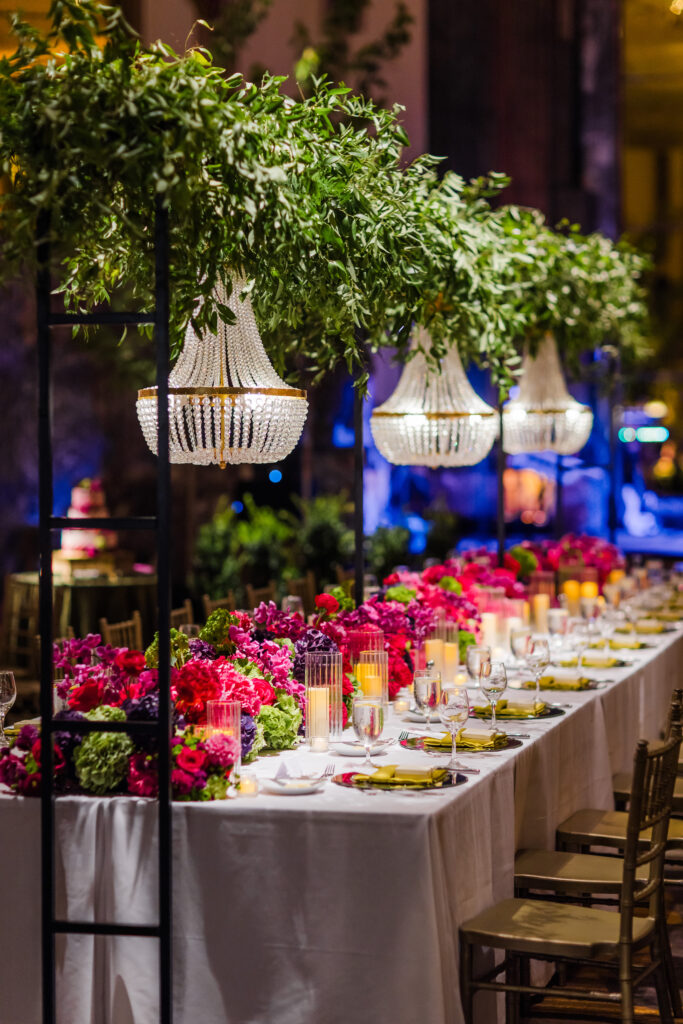
Set against the elegant backdrop of the Hilton Renaissance, the stationery and signage complemented the venue’s classic architecture without overwhelming it. Every detail was designed to enhance the space, not compete with it, allowing the crest to quietly anchor the celebration.

Captured by Bambino International Photography, Devon Sanford’s wedding is a beautiful example of how custom artwork can define a celebration. With a floral watercolor crest as the centerpiece, this wedding proves that when design is thoughtful and consistent, it becomes part of the story guests remember long after the day has passed.

Wedding Team:

Photographer:  Frame 805 | Venue: The View | Stationery and Signage: Posh Paper

Timeless Luxury and Refined Detail for Emily + Connor

Emily and Connor’s wedding design was rooted in timeless elegance, where every detail was intentional and every material chosen with care. This celebration embraced a refined aesthetic that allowed craftsmanship, texture, and typography to take center stage, proving that true luxury lies in the details.

The invitation suite was designed as a statement of quiet sophistication. A custom watercolor crest served as the foundation of the design, delicately painted and brought to life with rich gold foil stamping. The interplay between the organic watercolor artwork and the structured brilliance of foil created a look that felt both classic and elevated.

Printed using letterpress on fine cotton paper, the suite carried a beautiful tactile quality. The use of 2-ply cotton stock added noticeable weight and dimension, giving the invitations a substantial, heirloom feel the moment they were held. Every impression was crisp and intentional, highlighting the beauty of the fonts and the simplicity of the layout without unnecessary embellishment.

That same sense of cohesion extended throughout the wedding day. Custom signage and a mirror seating chart echoed the invitation design, allowing the crest and typography to carry seamlessly from paper to space. These pieces were designed to enhance the guest experience while maintaining the refined visual story established from the very beginning.

Emily and Connor’s wedding is a perfect example of how elevated materials and thoughtful design can speak volumes. By focusing on fine cotton paper, letterpress printing, gold foil, and restrained artistry, the result is a celebration that feels timeless, polished, and undeniably luxurious.

Special Styled Shoot by Bambino International Photography

Wedding Shoot by Kayla and Caleb Photography

Wedding Team:

Photographer: @kayla.and.caleb // Venue: @monasteryeventcenter // Venue Coordinator: @weddings_with_kris // Florals: @theweddingdesigner1 // Cake: @aspoonfullasugar // Dress: @carriekaribobridal // Make-up: @janaybeauty // Hair: @hairbymaddiewoff | Invitations and Signage: Posh Paper

Refined Destination Wedding for Penny and Christopher

There is a certain kind of beauty found in simplicity. For Penny Theodoreau’s destination wedding in Scottsdale, every detail was thoughtfully pared back, allowing craftsmanship, materials, and typography to take center stage. The result was a celebration defined by quiet elegance and timeless design. Set within the grandeur of a Greek Orthodox church, the ceremony carried a sense of reverence and tradition that shaped the overall aesthetic. Rather than competing with the architectural beauty of the setting, the stationery was designed to complement it. Clean layouts, intentional spacing, and classic fonts created an invitation suite that felt both respectful of tradition and effortlessly modern. The focus for this design was entirely on the paper itself. Fine cotton stock provided a soft, tactile foundation, while gold foil stamping and letterpress printing added depth without excess. Each impression felt deliberate, highlighting the beauty of the fonts and the subtle luxury that comes from expert craftsmanship. There was no need for embellishment. The materials spoke for themselves. As a destination wedding, the invitations played an especially important role. They offered guests their first introduction to the tone of the celebration, setting expectations for a wedding rooted in refinement and intention. The balance of gold foil and letterpress reflected a philosophy we love returning to: that true elegance often lies in what is left out. Captured beautifully on film by Serendipity Cinema, the day unfolds with a sense of calm and grace that mirrors the design itself. From the ceremony to the atmosphere surrounding the celebration, every moment feels thoughtfully composed and deeply personal. Penny Theodoreau’s wedding is a reminder that simplicity, when executed with care, creates lasting impact. Through classic typography, fine materials, and restrained design, this destination celebration proves that timeless style never needs to shout.

Wedding Team:

Ceremony Venue: Assumption Greek Orthodox Church | Stationery and Signage: Posh Paper

Modern, Art-Inspired Wedding at The View for Kayt and Brian

Kayt and Brian’s wedding at The View was a celebration rooted in modern elegance, elevated by thoughtful details and a design story that felt truly one-of-a-kind. With clean lines, intentional styling, and artistic influences woven throughout, every element worked together to create a cohesive and visually striking experience.

The design concept drew inspiration from Kayt’s nail art, a subtle yet creative influence that guided the look and feel of the stationery and day-of details. Translating that inspiration into paper and signage allowed the design to feel fashion-forward while remaining refined and timeless. The result was a wedding aesthetic that felt personal, modern, and artfully curated.

The invitation suite set the tone from the very beginning. Clean typography and intentional layout choices introduced guests to the celebration’s elevated style, offering a glimpse into the thoughtful design they would experience throughout the day. Each piece was created to feel cohesive, polished, and expressive without overwhelming the overall aesthetic.

On the wedding day, the details truly came to life. Two custom mirrors served as statement pieces, guiding guests and anchoring the space with both function and beauty. Place cards, table numbers, and a custom bar sign continued the visual story, ensuring every touchpoint felt connected. These elements weren’t simply decorative; they were designed to enhance the guest experience while reinforcing the overall design vision.

Set against the modern backdrop of The View, the stationery and signage complemented the venue’s clean architectural lines and expansive atmosphere. Captured beautifully by Frame 805, the day reflects how intentional design choices can elevate a celebration, transforming inspiration into an immersive experience.

Kayt and Brian’s wedding is a perfect example of how a distinct design story can be woven throughout a wedding day. By drawing from unexpected inspiration and translating it through custom stationery and signage, the result is a celebration that feels cohesive, elevated, and unmistakably personal.

Wedding Team:

Photographer:  Frame 805 | Venue: The View | Stationery and Signage: Posh Paper

A watercolor wedding invitation featuring the couple's wedding venue illustration.

Southern Charleston Charm for Rachael and Simran

There is something undeniably romantic about a Charleston destination wedding. From its historic architecture and graceful facades to the soft coastal light that seems to linger just a little longer, Charleston sets the tone for celebrations rooted in tradition, beauty, and timeless Southern charm. Rachael and Simran’s wedding embraced all of that elegance, with thoughtful details woven seamlessly throughout the day.

From the very beginning, the stationery and signage were designed to reflect the spirit of the destination. A custom watercolor illustration of the venue became the heart of the paper suite, capturing the warmth, character, and architectural beauty that make Charleston such a beloved place to say “I do.” Soft washes of color and hand-painted details brought the setting to life, offering guests an early glimpse of the experience awaiting them.

The watercolor venue artwork carried through every touchpoint, creating a cohesive visual story. From invitations to day-of signage, each piece felt intentional and connected, allowing the design to guide guests through the celebration with ease and elegance. This layered approach is one of our favorite ways to elevate destination weddings, blending artistry with a sense of place that feels personal and unforgettable.

On the wedding day, signage continued to play a meaningful role. Designed to complement the venue’s Southern charm, each sign felt refined yet welcoming, enhancing the natural beauty of the surroundings without overpowering it. The result was an experience that felt curated, graceful, and perfectly suited to a Charleston celebration.

Rachael and Simran’s wedding is a beautiful example of why we love destination weddings so much. By grounding the design in the location itself, every detail becomes part of the story. Thoughtful stationery, custom watercolor artwork, and cohesive signage come together to create an experience that guests remember long after the day has passed.

Wedding Team:

Photographer:  Catherine Ann Photography | Venue: Lowndes Grove Plantation | Stationery and Signage: Posh Paper

A Hall of Mirrors Wedding to Remember for Gwen & Alex

Gwen and Alex chose one of Cincinnati’s most iconic spaces for their celebration, and it’s easy to see why. The Hall of Mirrors at The Hilton feels straight out of Europe — inspired by the Palace of Versailles, with soaring 30-foot ceilings, gold-plated mirrors, striking Art Deco details, and a dramatic balcony that instantly sets the tone for something unforgettable.

With a venue this ornate, every detail mattered. We created a custom illustration of Gwen’s bright, colorful florals and paired it with rich gold foil stamping to reflect the warmth and grandeur of the space. That look carried seamlessly throughout the day — from the invitation suite to menus and signage — creating a cohesive visual story. Gwen also chose one of our gold mirrors for her seating display, a natural fit that echoed the venue’s iconic design. The result was a thoughtfully layered experience that blended playful color with timeless elegance, all while feeling personal and true to the couple.

Special Styled Shoot below by: Bambino International Photography & Calligraphy envelope by Lime Lily Calligraphy

Wedding Team:

Photographer:  Jonathan Gibson Photography| Venue: Cincinnati Hilton Hall of Mirrors | Florist: The Budding Florist | Wedding Planner: Blue Dahlia Events | Mirror Seating Chart : Posh Paper with calligraphy by Three Maries Lettering | Stationery/Signage: Posh Paper